Visual Editor
Vibe includes a visual editor that lets you customize your application's appearance without writing prompts or code. Toggle the Visual edits button in the chat composer to flip design mode on and off — click elements in the live preview when it's on, then toggle it off to return to prompting. No hunting for a separate control.
Editing a specific element
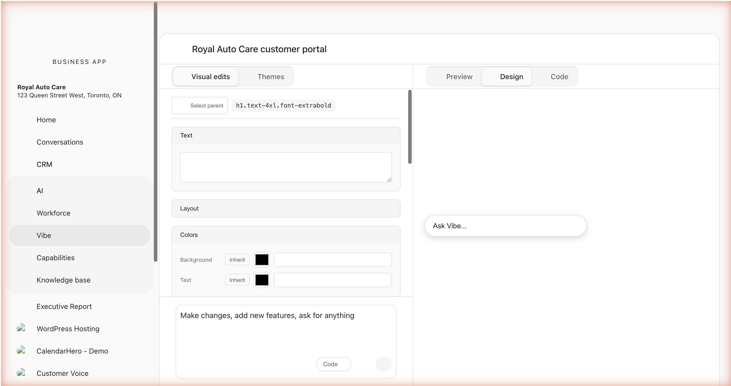
Click any element in the live preview to select it. A blue outline marks the selection. You can also click Select parent to walk the selection up to the containing element.
When you select an element, Vibe gets exact context about what you clicked: the source file, the line and column in that file, the JSX tag, the CSS classes, and the text content. That context travels with any prompt you send while the element is selected, so when you ask for a change Vibe edits the right element directly — no guesswork from prose descriptions.
You can select up to ten elements at once. Vibe handles each one in the same prompt.
Two ways to ask for a change
Once an element is selected, you have two paths:
- Inline quick-edit — A small chat input appears near the selection. Type a one-line change ("make this bigger and bolder," "change the color to navy") and press enter. Best for fast tweaks where you don't need to leave the canvas.
- Main Design panel chat — Open the Design panel chat for longer changes that need more context, more steps, or a follow-up question from Vibe. The selection still travels with the prompt, so Vibe knows what you're talking about.
Both paths produce the same result. Pick whichever fits the change you have in mind.
Direct edits without the chat
For some properties you can edit the value directly in the Visual edits panel without sending a prompt.
Text elements
- Edit the text content directly.
- Changes are synced back to the source code.
Image elements
- Change the image source URL.
- Set alt text.
- Adjust object-fit and object-position.
- Configure loading behavior (lazy/eager).
Icon elements (Lucide icons)
- Browse and pick from 900+ Lucide icons.
- Adjust icon size.
- Change icon color.
Link elements
- Edit the href URL.
- Set the target (new tab, same tab).
- Configure title and rel attributes.
Style properties
For any selected element, you can modify:
| Category | Properties |
|---|---|
| Colors | Text color, background color |
| Spacing | Padding, margin |
| Typography | Font size, family, weight, style, alignment, line height, letter spacing |
| Effects | Box shadow (none, sm, md, lg, xl), opacity, border radius |
| Layout | Display (flex/grid), direction, justify, align, gap, wrap |
All changes update the source code, so they persist and you can see them in Code mode.
Visual editor vs. main chat
Both the visual editor and the main chat reach the same generation engine. The difference is what context travels with the prompt and how scoped the change is.
| Best for the visual editor | Best for the main chat |
|---|---|
| Targeted edits to a specific element you can see | New sections, pages, or features |
| Style tweaks across sections | Restructuring navigation or layout | | Swapping icons, images, or alt text | Adding responsive behavior | | Style tweaks: padding, color, font size on one element | Multi-component changes that aren't about a single element |
The visual editor is best for small, targeted adjustments anchored to something on screen. For structural changes or anything that doesn't start from "this thing right here," the main chat is the right entry point.
Next Steps
- Prompting Guide — Write effective prompts for changes that go beyond the visual editor
- Connectors — Wire your app into forms, analytics, and sign-on
- Prompting Library — Ready-made prompts for common refinements